Improving Content Manager experience in Headless CMS
Kentico Kontent (jun 2019 - sep 2019)
Case study for this projectis still in the works.
Before I publish the shiny version here, you can check out the brief notes on this project below, or I'm more than happy to discuss the details with you in person.
My
Role
Contributor / Designer :
Product and problem space discovery, problem definition, facilitation of design workshops, interaction and UI design, usability testing, quantitative analysis
The
Team
I provided UX support in a product team of 4 developers with occasional help from our Product Manager and my colleagues from the UX team.
The
Outcome
Improved usability of a feature – proved by its rapidly increased adoption and spontaneous qualitative feedback from our users.
01
Product and Audience
This feature was created for Kentico Kontent - a headless CMS. In a Headless CMS world (and whole content design world) there's this thing called content modelling – basically it is a part of content design realm - people (usually content managers) are responsible for the how some content will be organized and presented in a some channel. For example - how an article or blog will be organized in an app for a newpaper. Or how an article detail will be displayed in an online shopping experience.
And as you can see it's pretty important to content managers 👉
What’s one of the best things about #HeadlessCMS? Hear what our Kontent MVP @KristianTT has to say and check out his excellent series on content modeling published on our blog 🙌
— Kentico Kontent (@KenticoKontent) March 8, 2021
First part: https://t.co/zuW7E8010o
Second part: https://t.co/sxx4gYfXyc#contentcreation pic.twitter.com/hx2uE9Qdwz
02
Problem space
(story of a usability hotfix)
We already implemented feature to improve the information architecture for mentioned scenarios. It wasn't quite scanable or easy to orient in. And in the end not even much usable -the disorganized interface posed quite a challenge for ever very experienced content editors and managers.
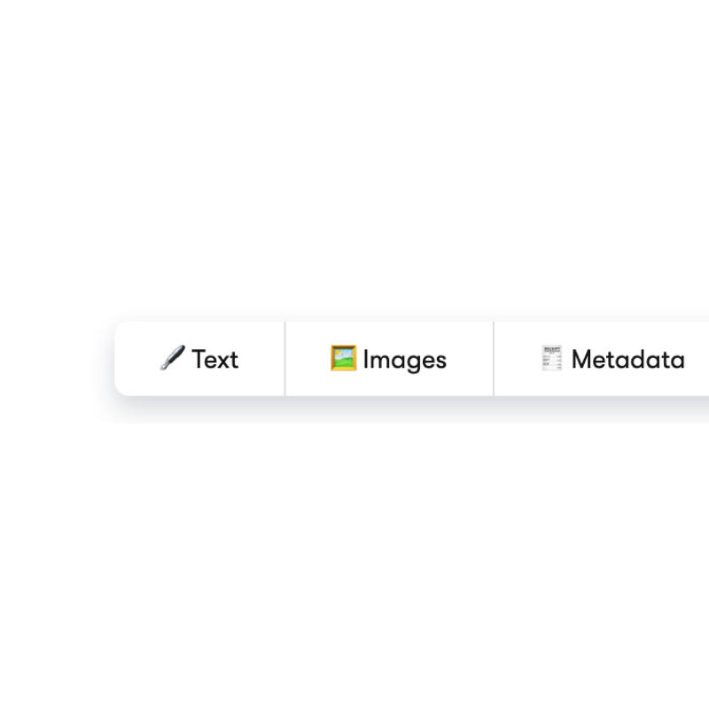
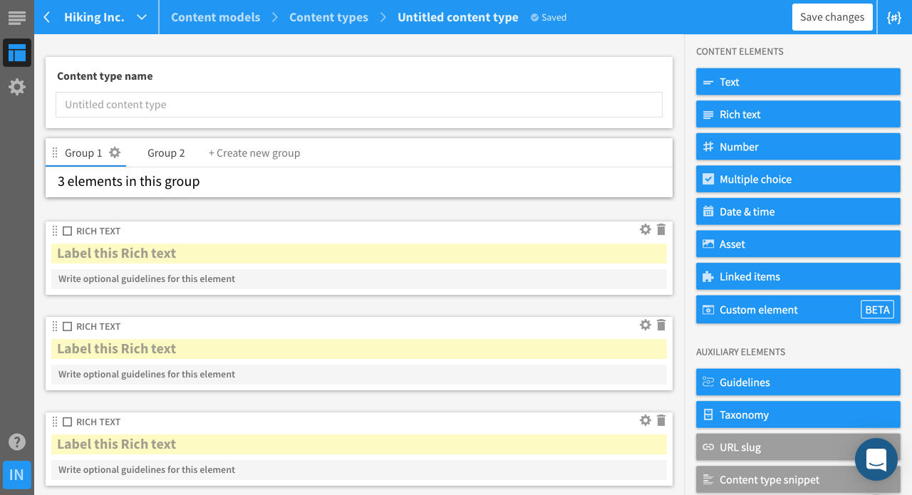
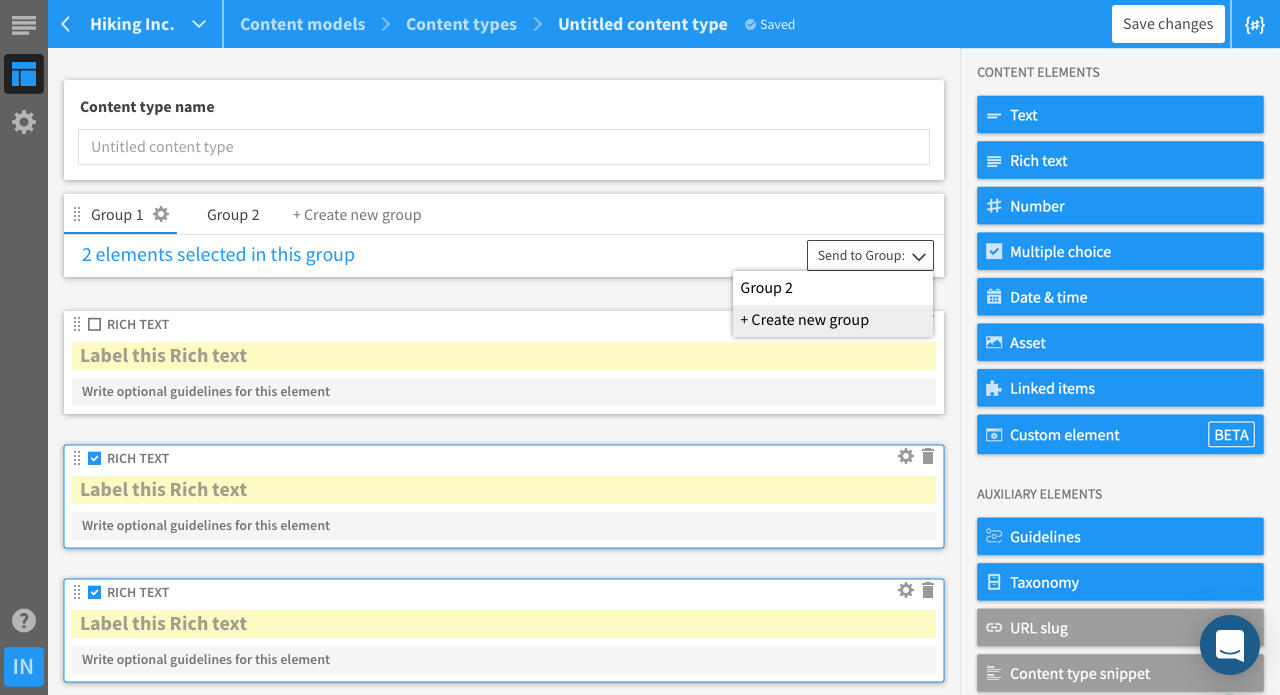
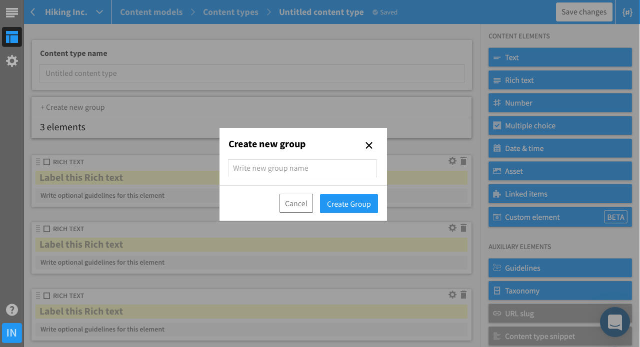
We introduced a way to group these content blocks into semantically coherent groups - content managers could define separate groups for various kinds of content - a separate group for displayed content, different one for OG images or assets for socials, different one for metadata.
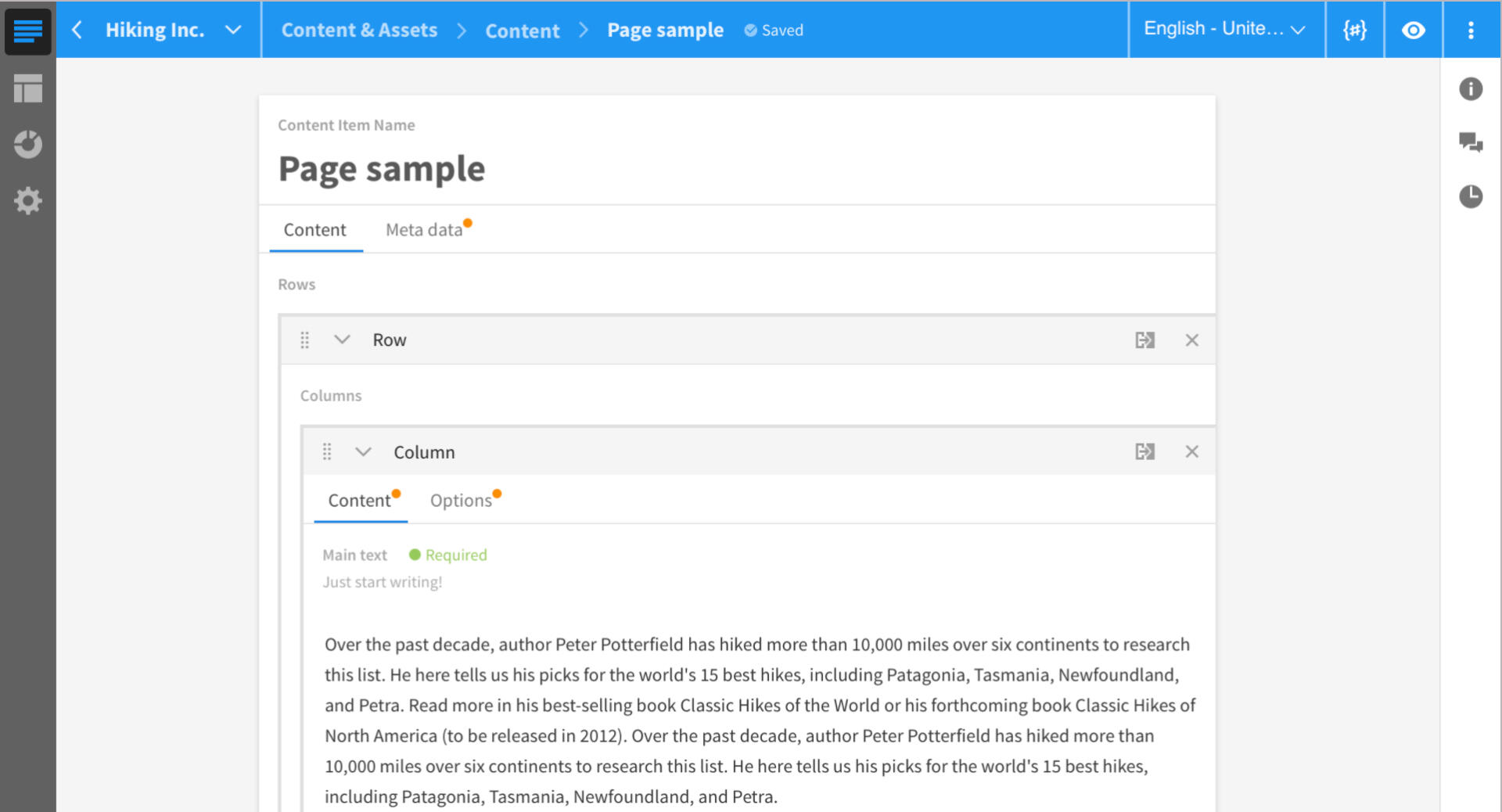
In the content editing interface these groups were represented by nice and clean tabs. However in the content modelling interface (the place where the "information architecture" of presented content is set up) these were represented in quite different manner similar to tree structure.
the content editing part of the app ☝️

and the content modelling part of the app ☝️
03
Research and insights
We operated with qualitative insights from Usability Testing of previous iteration and with the metrics of usage deployed after the release of the feature
The feature was heavily requested and praised by content editors, however its adoption rate continued to be quite low and the findings from UT showed all participants struggled or some were even unable the finish the task aimed on creating the grouping structure in the setup interface.
Therefore there was no need for further data gathering or research.
04
Designing the solution
Ideation
First I ran a design studio workshop to explore (and validate) possible concepts
Unsuprisingly one of the most viable and most frequently mentioned way of approach was to mimic the visual structure present in the content editing interface
However there were some more complex use cases that neede more design care - for example: how would the interaction for creating a new group look like? How could one move content elements from one group to the other etc...
I designed these with my development team - the most obvious solution would be to drag and drop everything, however it would be much too costly for a usability hotfix such as this. Feel free to browse the solution on the right:
Grooming and implementation
I tried to make the experience and the interaction as intuitive, convenient and delightful, however after grooming we decided to cut the solution and improvements into multiple smaller batches and iterations in order to bring the usability and usefulness to the customer as soon as possible.
First was just basic functionality (create, name and reorder groups via more complex interaction) and visual redesign
Second were a few improvements in interaction design (drag an dropping, controlling the positions of group, fine tuning the logical edge cases – e.g. what would happen if we were to delete a whole content group witch some content structure already present in it etc.
05
Reception and impact
Improved usability led to warm reception, now it is extremely widely used feature of the product with good and easy adoption.
The usage number went up significantly, and the feature continues to be our differentiator in the sales process.
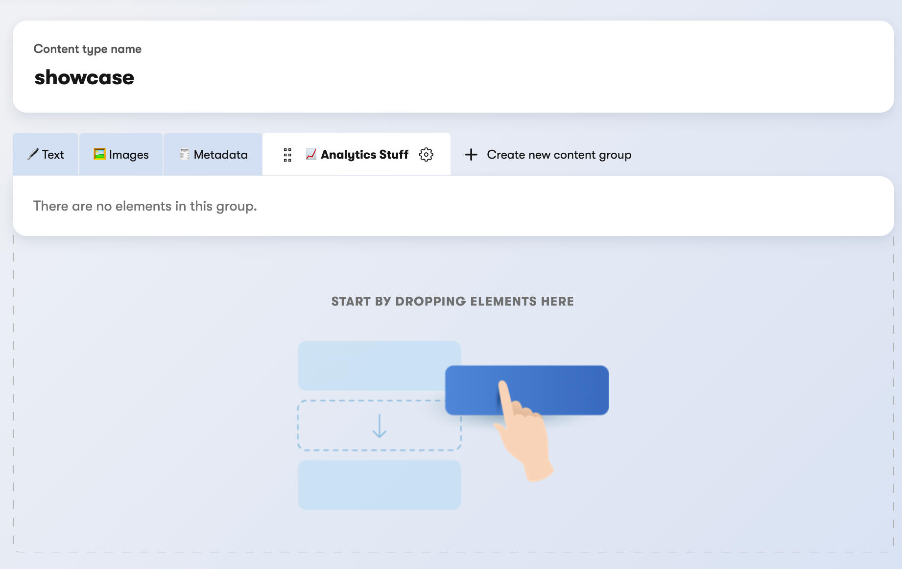
This is what the feature looks like now, in our redesigned UI
What did I learn:
Don't underestimate the importance of familiarity in user interface and interactions
It was my first bigger project with my development team, I learned the value of prompt cooperation and inclusion of everyone in the team to the design process
I also learned that although it is important to try make the experience as nice and intuitive as possible, it is the value the feature brings to the user that is little bit more important. It is better to bring quickly a feature which has few minor usability inconveniences than to bring user something that is 110% but to keep them waiting for it for unnecessary amount of time. The first tier of user delight pyramid is effectivity and value it brings. The fine-tuned interactions can wait a second.
© Peter Rod. All rights reserved.
Thank you
Magna viverra aliquet eget sit amet tellus cras adipiscing enim quisque sagittis purus lorem sed consequat.
Thank you
Magna viverra aliquet eget sit amet tellus cras adipiscing enim quisque sagittis purus lorem sed consequat.